From Cup to Canvas
A fun project to make an infographic for my favorite beverage: chai

Brewing the Idea
Masala chai is more than just a beverage to me; it's a blend of culture, nostalgia, and (almost) daily ritual. To celebrate this, I embarked on a creative journey to design a detailed infographic that captures the essence of chai. The final design evolved into a poster-worthy piece showcasing the anatomy of masala chai, nutritional facts, and fascinating trivia, all wrapped in an engaging visual format.
This project became an opportunity to flex my creative muscles, hone my information visualization skills, and dive deep into typography, illustration, and color design.
Some Ground Work
What makes chai, chai?
The first step was breaking down the essence of masala chai. I explored questions like:
What are its essential ingredients?
What is the history behind this iconic beverage?
What are the nutritional benefits and facts worth sharing?
Visual Research
I reviewed infographic styles, typography trends, and color palettes that could complement the rich, warm tones associated with chai. My aim was to create an aesthetic that was both informative and visually appealing, with a slight nod to traditional Indian design motifs.
Early Sketches
From ideas to inspiration
Before diving into Adobe Illustrator, I sketched out multiple layouts to organize the information effectively. Key elements included:
A sectional breakdown of chai's ingredients (tea leaves, spices, milk, sugar).
Trivia such as chai's history and fun facts about its global popularity.
A nutrition table to inform health-conscious tea drinkers.
These sketches helped refine the flow of information, ensuring each section received appropriate focus without overwhelming the viewer.

Some quick sketches trying out layouts for anatomy of chai
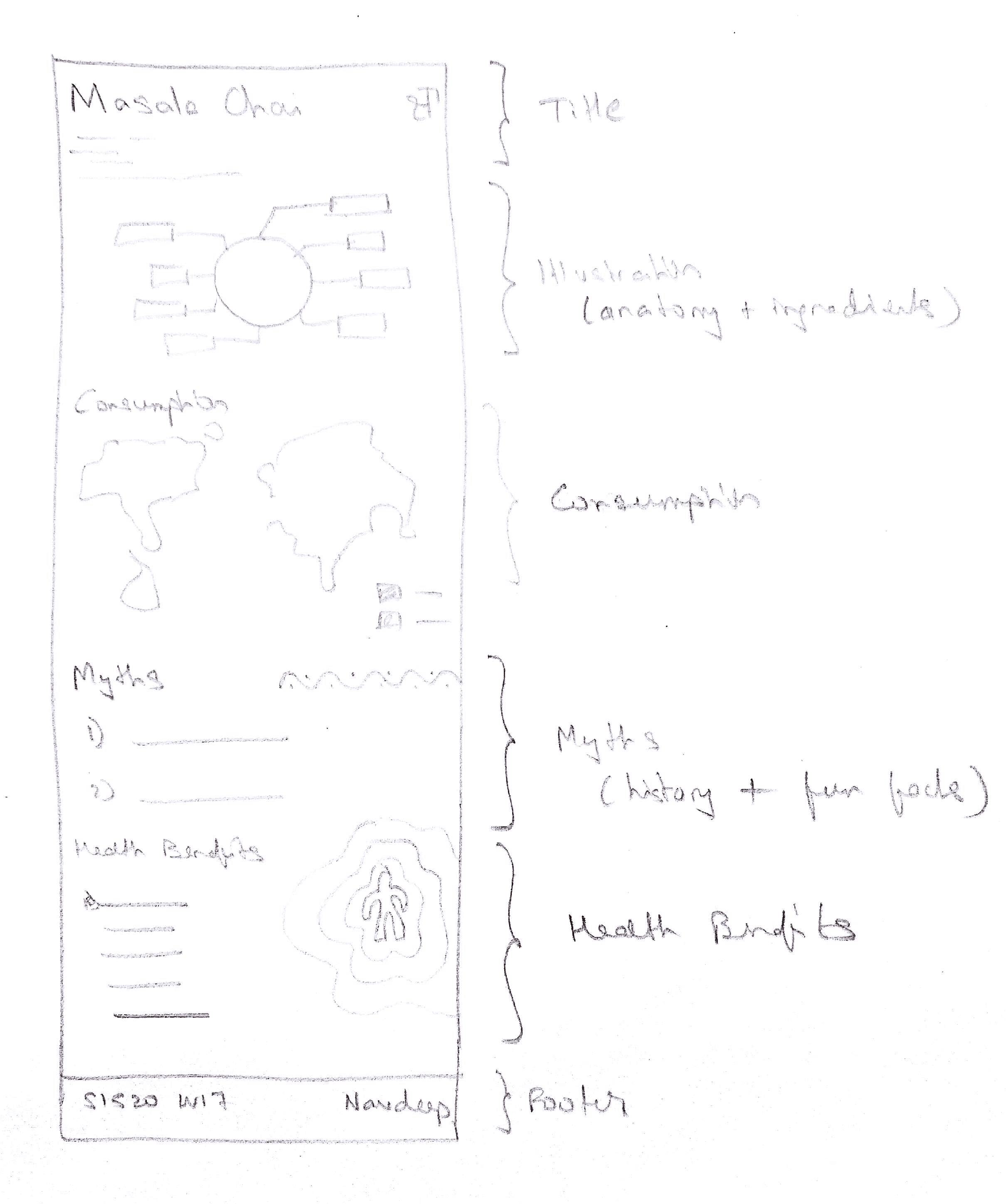
Some quick sketches trying out layouts for anatomy of chai
Defining Design Language
To evoke the warmth and comfort of chai, I selected:
Typography: A combination of clean, modern sans-serif fonts for readability, paired with elegant serif fonts for headings to add a touch of sophistication.
Color Palette: Earthy tones like clay, sand, and subtle hints of spice-inspired colors (cinnamon, cardamom green).
These choices created a harmonious blend of tradition and modernity, reflecting chai's timeless appeal.
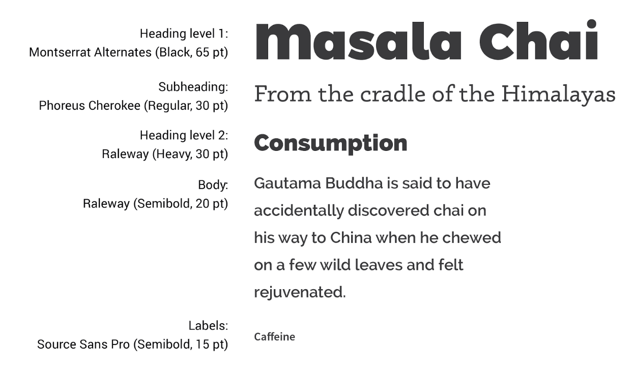
Typefaces selected for the infographic

Illustrations created for the infographic
The Final Design
Using Adobe Illustrator, I brought the sketches to life:
Information Hierarchy: Clear sections for ingredients, trivia, and nutritional facts, ensuring a logical flow.
Visual Elements: Illustrated icons for chai ingredients and minimalist charts for nutritional data.
Attention to Detail: Balanced whitespace and visual accents to avoid clutter while maintaining visual interest.

Full infographic design on Masala Chai
Challenges and Learnings
Simplifying Complexity: Distilling rich information into concise, visually digestible pieces was a challenging yet rewarding process.
Typography Pairing: Ensuring the fonts worked cohesively across sections taught me the value of type hierarchy.
Cultural Representation: Striking a balance between modern design sensibilities and traditional chai aesthetics required thoughtful iteration.
Takeaways
Storytelling Through Design: Even a simple beverage can inspire a rich narrative when approached creatively.
Typography Mastery: Pairing fonts and creating a cohesive hierarchy can elevate any project.
Information Design: Presenting complex data in an approachable format is a valuable skill applicable across industries.
fin.