Turning Debt into Opportunity: A UX Redesign Initiative
How a design-led initiative led to real change and impact for end users

Overview
Revamping a broken experience is never just a design challenge; it’s a test of vision, grit, and teamwork. At Nutanix, we faced a significant obstacle with the Prism Tasks feature, a core area of our product that had long frustrated users with inconsistent UX patterns, unclear workflows, and limited scalability. Examples include missing information about who initiated an operation, confusing error messages and absence of parent/child hierarchy for certain operations. These greatly impeded the user experience of troubleshooting on Prism using Tasks.
The Prism Tasks Revamp project began as a design initiative to address these pain points, but it quickly became clear that solving them required more than just surface-level changes. Over two years, this project evolved into a collaborative effort involving product, design, and engineering teams. Together, we tackled not only the user experience issues but also the underlying technical debt, creating a more intuitive and robust system that aligned with user needs and our product vision.
This case study highlights how we navigated complex dependencies, balanced short-term fixes with long-term goals, and worked cross-functionally to turn a frustrating experience into one of empowerment. It’s a story of persistence, teamwork, and a commitment to making every user interaction count.
✏️
I also wrote an article about this: "Prism Tasks: A UX Odyssey"
Impact
External
We conducted evaluative studies with users who rendered this qualitative feedback:
This is a billion times better!
Less jumping around.
It's party time!
The Filters are absolutely amazing!
Internal
Nutanix support professionals felt empowered to demonstrate the new Tasks UX to prospective customers. This made a solid first impression for new prospects and customers.
Testimony
This project was concluded in November 2024. Some thoughts from the team:
The process of redesigning the tasks UX in Prism has been a challenging one, and Navdeep has spearheaded it from the beginning. He showed a lot of patience and persistence in getting this effort across the finish line as there were a lot of obstacles to overcome.
BC,
Sr. Director, Design
The Problem
The Tasks view had not kept pace as the overall Prism product grew. Tasks view was using obsolete interactions which led to navigation issues. Even the error reporting was not great as a lot of technical jargon was used defeating the purpose of troubleshooting. Above all, this project was not getting prioritized by Engineering to implement in their roadmap.
The Solution
I kickstarted the project as a design-led initiative and collaborated with another designer and product manager to create a brand new Tasks UX informed by user insights. We then showed the new designs to stakeholders from Product and Engineering team, and converted this project into an engineering roadmap priority. APIs were written from ground up to implement the new UX.
Role
Lead UX Designer
Duration
~2 yrs
Status
Released in Nov 2024
Tools
Figma
Slack
Zoom
Google Workspace
New Tasks UX
Discovery
What are Tasks?
Nutanix users rely on Prism, a web interface that IT admins use to manage their private cloud environment. Some day-to-day operations include creating Virtual Machines (VM), migrating them, allocating storage, etc. These operations take time and are carried out in the background.
Typically, a team of IT admins manage the same environment depending on their role and expertise. All these background operations are aggregated in a dedicated view called Tasks.
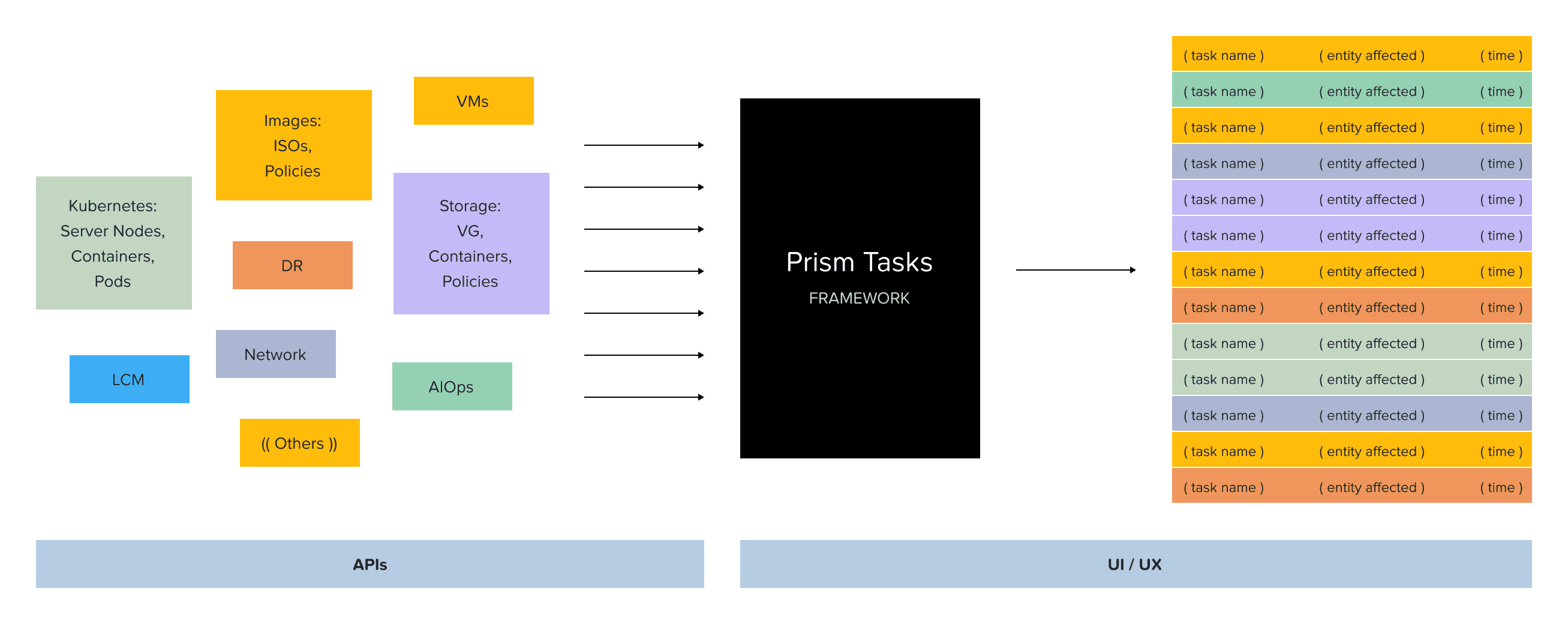
Tasks as a "black box": a framework to format async operations on the UI
Issues with existing Tasks view
There were tons of issues with the existing Tasks view. Some were pretty evident from a high-level heuristic evaluation, and some of them we collected from users and internal stakeholders. In a gist, things were not looking great, and something had to be done. Some issues identified:
Who initiated the Task?
Unable to copy error messages
Broken navigation using browser forward/back buttons
Absence of parent-child hierarchy for Tasks to know associated sub-tasks
Bare support for filtering to view specific tasks based on entity type, time range, etc.
Missing information; the entity affected for some tasks was not available at all
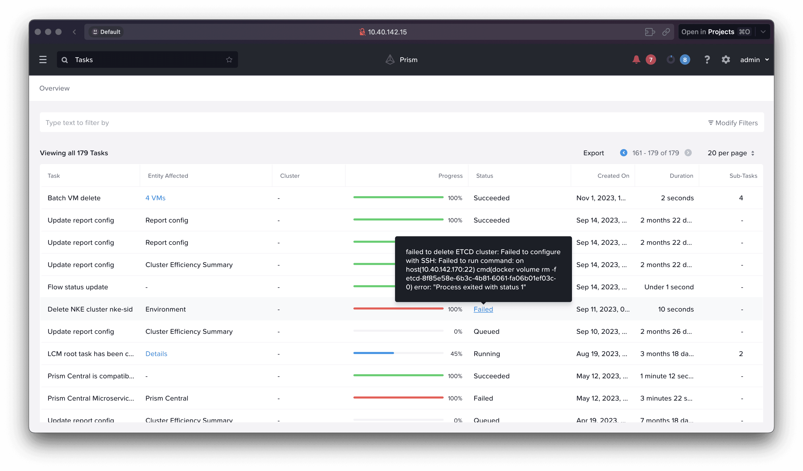
Screenshot of old Tasks view on Prism showcasing confusing error messages
Formative feedback from users
This is what some of our users had to say about the existing Tasks user experience:
Other than being able to see a generic activity that occurred, it (Tasks page) isn't currently very helpful. Not enough information presented to even be useful, doesn't show who initiated a task or what the task entailed.
ND,
Trust Technology Solutions
From memory it's not easy to report on who, what, where, when.
KM,
Cutter Group
Hard to drill down, and then drill up again, since it's based on filters!
JH,
GDM
We should be able to click on a particular task and see ALL details about that task.
JD,
Bottomline Technologies
Formative feedback from internal stakeholders
Even folks from customer-facing functions were not too excited about demonstrating Tasks UX to prospective customers.
While it's fun to talk about how much better we are than VMware, they sure can do basic things like tasks in vCenter WAY better than we can… I would argue that our tasks do the exact opposite and build less confidence in the system when we can't get the Admin consistent information on what is happening.
DH,
Cloud Architect @ Nutanix
This is one thing that I am always extremely embarrassed about when I go into a live demo or when a customer requests for us to take a look at their env to share "insights" on what has been going on in their clusters.
WS,
Sr. Systems Engineer @ Nutanix
Use cases defined
Based on discussions with stakeholders and external users, we identified the following 2 key use cases that an admin would need the Tasks view for. These helped us understand the user’s mindset better.
Troubleshooting
Admins visit Tasks if anything goes wrong with their infra env. Knowing when something went wrong is key along with appropriate error logs.
Monitoring
Admins also passively visit Tasks page to see a bunch of task statuses together which gives them a sense of their overall infra health.
Building empathy
To incentivize our stakeholders, we used caricatures to tell the story of how an admin’s well-planned weekend could be totally ruined because of issues with existing Tasks UX. This really conveyed the point of why we need to fix this for our stakeholders.
Huge shoutout to Sourabh Daroji (UX Design Intern at that time) for getting this idea to life!


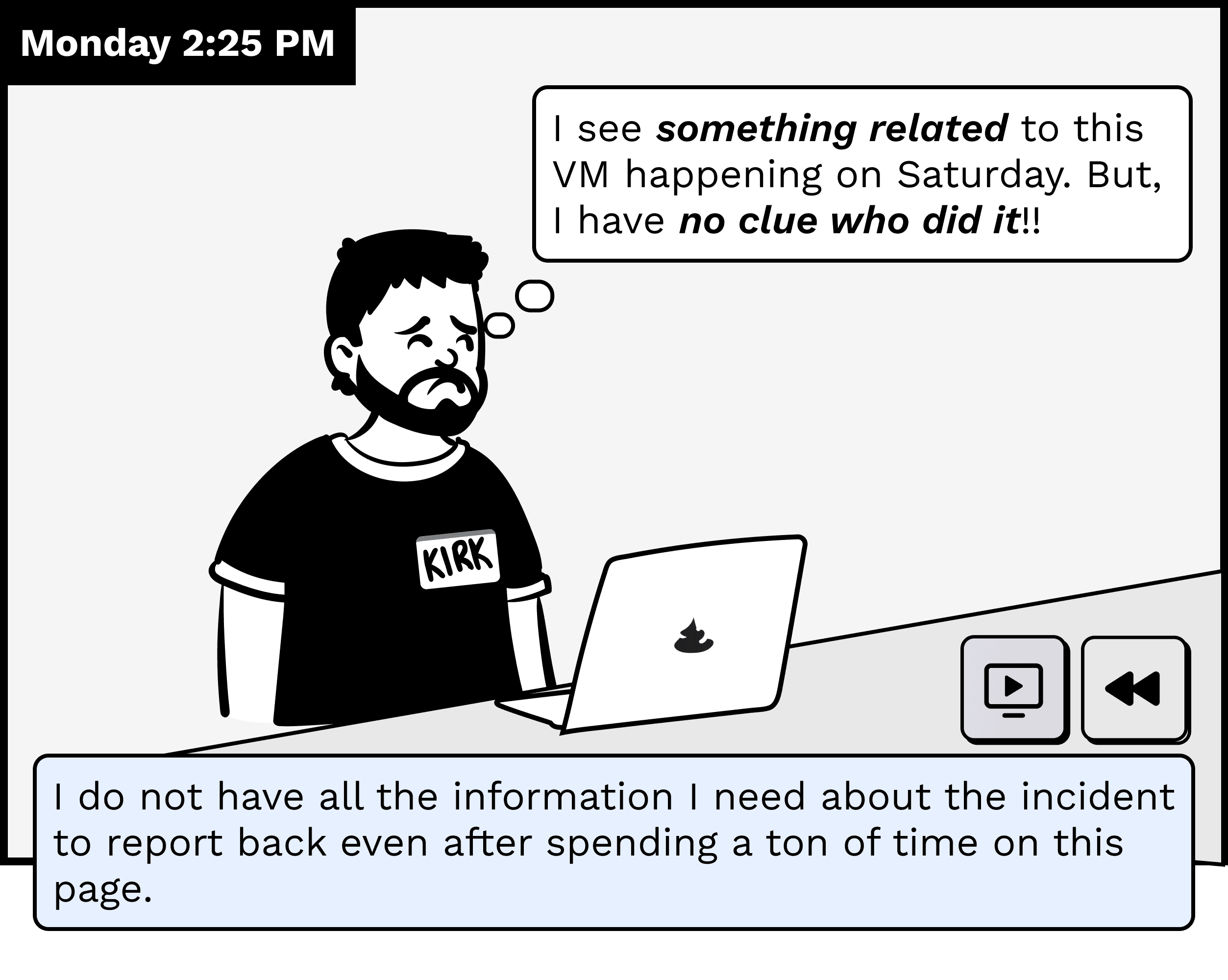
Kirk, the admin, trying to figure out an issue but unable to find the root cause
Design
User stories
We started off the design process by laying down these user stories:
As an admin, I want to view a tasks’s details so that I can track its progress.
As an admin, I want to understand why a particular task failed so that I can troubleshoot it.
As an admin, I want to filter tasks under a certain time range so that I can correlate information.
As an admin, I want to cancel a long running task so that I can free up infra resources for other tasks.
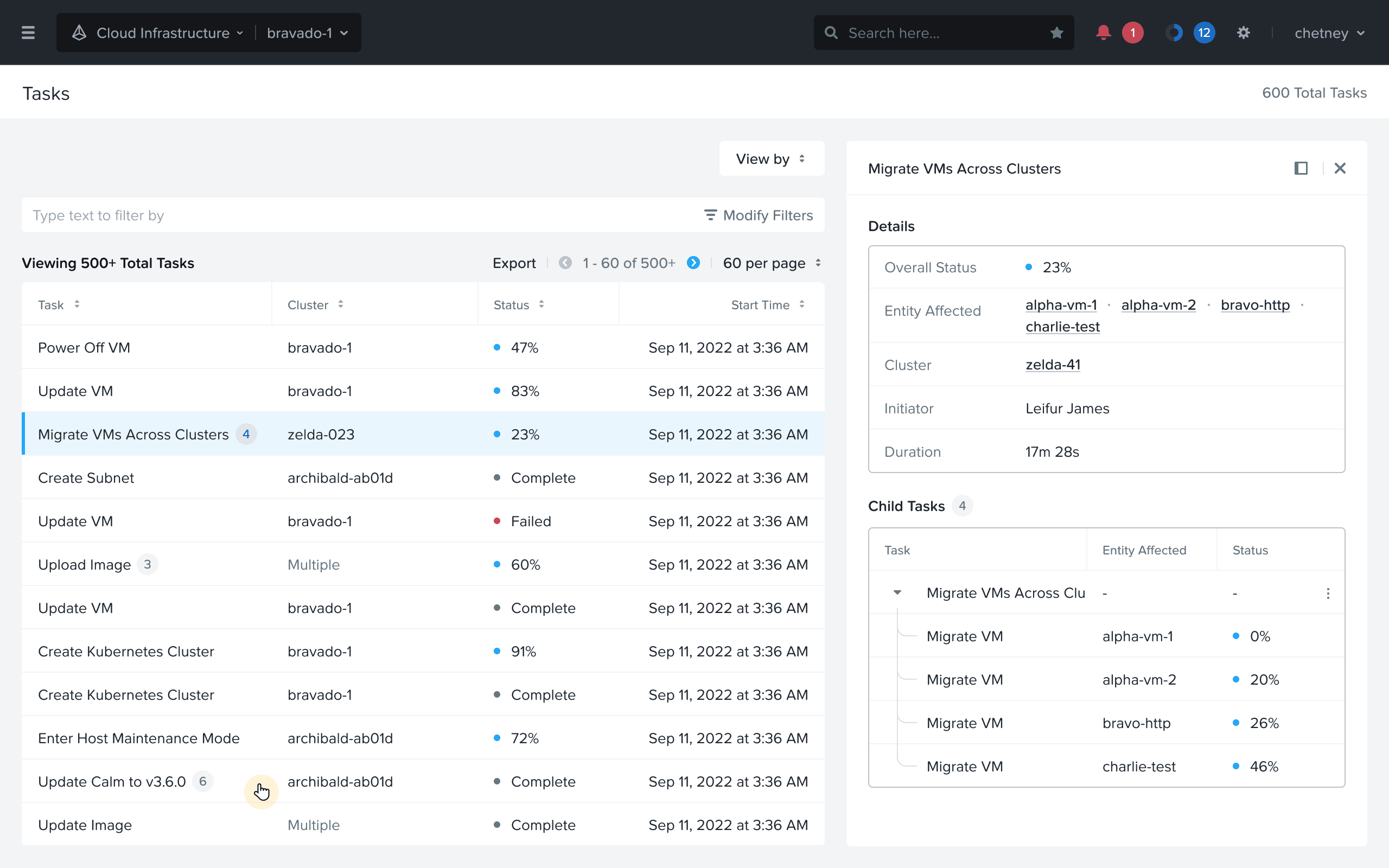
1. Drilling down a Task details
User Story: As an admin, I want to view a tasks’s details so that I can track its progress.
For a troubleshooting scenario, admins are often required to view various tasks within a time frame and drill down the details to pinpoint the source of the issue. In the old UX, they had to bounce around a lot for tasks with a hierarchy of child tasks.

Old UX for drilling down a Task details required multiple screens

New UX for drilling down a Task details involves only one click
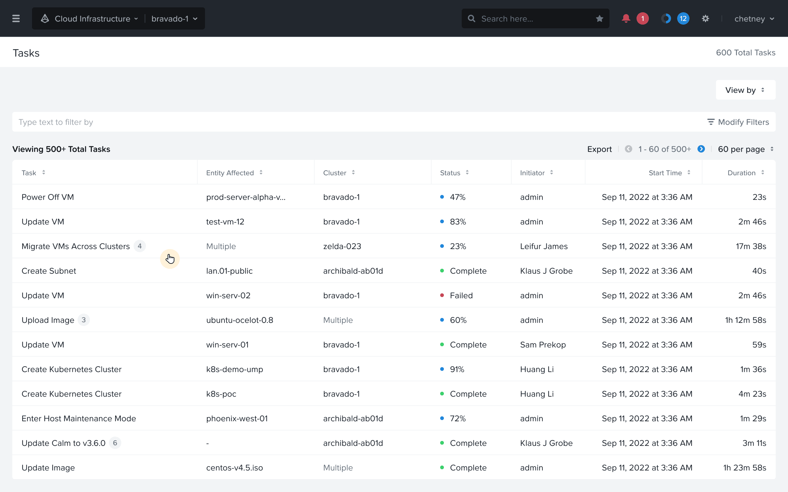
Drilling down a Tasks details: User clicks on the table row
Drilling down a Tasks details: User sees details, and can jump to another view
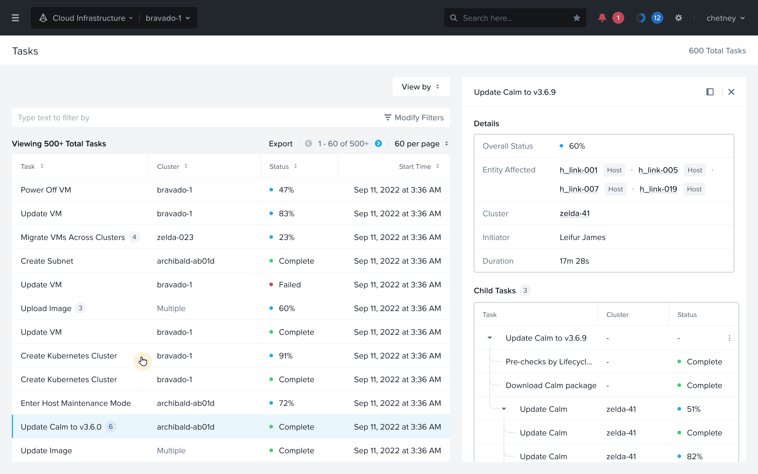
Drilling down a Tasks details: User sees details of another task
2. Better error reporting
User Story: As an admin, I want to understand why a particular task failed so that I can troubleshoot it.
Following on the story of troubleshooting, admins rely heavily on the errors shown. In the old UX, a lot of technical jargon was used in the error, and the interaction to persist them was not great.
Better error reporting: Showing errors in persistent banners
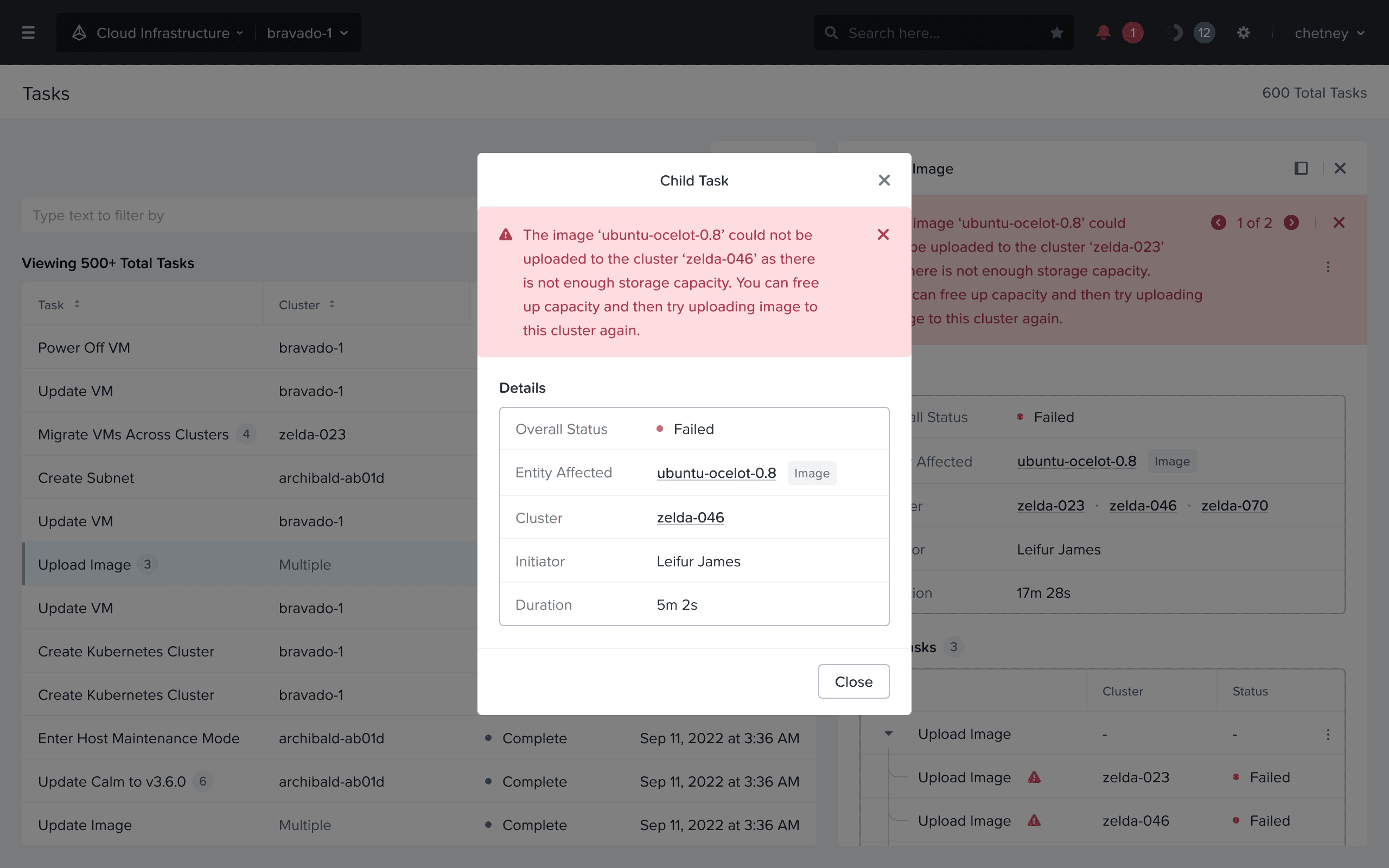
Better error reporting: Viewing errors mapped with child tasks
3. Expanded filtering support
User Story: As an admin, I want to filter tasks under a certain time range so that I can correlate information.
The Prism GUI can manage a bunch of clusters, and each cluster can generate a plethora of tasks depending on the activity on each cluster. These clusters are often divided by geography or by business use cases. In the old UX, users could only filter tasks by status, which was inadequate.
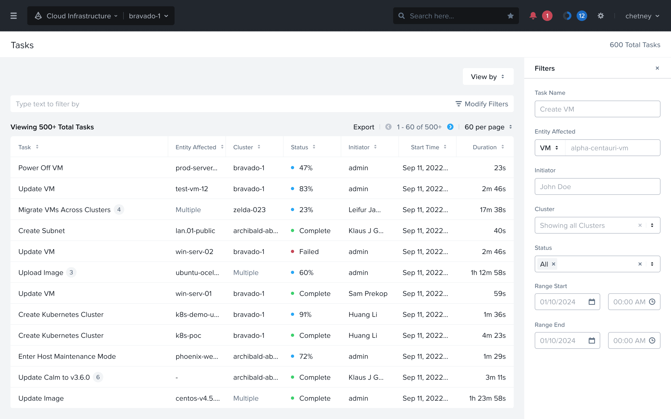
Expanded filtering support: Users can filter by a variety of attributes incl. time range
Impact
External
We conducted evaluative studies with users who rendered this qualitative feedback:
This is a billion times better!
Less jumping around.
It's party time!
The Filters are absolutely amazing!
Internal
Nutanix support professionals felt empowered to demonstrate the new Tasks UX to prospective customers. This made a solid first impression for new prospects and customers.
Testimony
This project was concluded in November 2024. Some thoughts from the team:
The process of redesigning the tasks UX in Prism has been a challenging one, and Navdeep has spearheaded it from the beginning. He showed a lot of patience and persistence in getting this effort across the finish line as there were a lot of obstacles to overcome.
BC,
Sr. Director, Design
Reflections
Show grit
Don’t give up on the first sign of hardship. Sometimes, you have to carry the torch by yourself, and it’s ok. You have to believe in the problem you’re solving. Fall in love with the problem, not the solution (as Don Norman said).
Don’t wait for a project team to be formed, or for someone else to drive an effort, just find an ally. At worst, you will create UX assets that are ready to be implemented and that puts “good pressure” on the engineering and product teams to follow through.
Have oversight on key engineering initiatives
The success of this project also relied on the timing of this project with a key API initiative at Nutanix. Oftentimes, what the UX team can deliver is impacted by the engineering roadmap.
Keep a pulse on the active initiatives across your org/company by discussing with your engineering colleagues, or your manager. Even if these initiatives seem unrelated to UX on the surface, you may uncover an opportunity to introduce design thinking and drive UX improvements.
Befriend timelines
It’s just another constraint..
Since this was mostly a design-led initiative, it would have been easy to get immersed in the details, and explore all possibilities. But having the constraint of a 3-month internship proved key in producing the first complete iteration, which was used abundantly to present our vision to the stakeholders.
fin.